I don't know what I envy most: that enormous conservatory, the decent sized private garden, the hard wood floors, their soft close kitchen units, or the wood burning stove. I think I'll chose the latter two as they are the most achievable for us. Then again, I've done my best not to keep up with "The Jones's" and I'm inclined not to try to keep up with "The Kids" either!
They had only about five days with access to both the old rented house and the new one and Simone was keen to have everything 'perfect'. She is German and on the Continent renting a flat is more common than owning a house. It took a while to convince her that buying was a good idea, but of course once she committed she was quite excited about having her own home.
Simon called on his dad's wallpapering expertise and we went down with all the decorating tools that would fit in the car. We worked about four hours when we arrived, I foolishly put in a straight ten hour day on Wednesday. On Thursday I could manage no more than a bit of puttering with frequent rest stops. We packed up the car and left Friday morning as Simone was back at work and Simon was left to unpack boxes and assemble furniture.
Though the decor was all pretty new, my guess is that the owner hadn't done much cleaning since it had sold. She left the ovens, the dishwasher and the refrigerator absolutely filthy. It used to be the custom to clean the house you left, but apparently not everyone signs up to this courtesy.
The 'before' photos are very attractive if a bit twee. The Simon's were looking forward to putting their own stamp on the place. Simone's preferred colors are the bright warm colours of the 1970s. My guess is that Simon chose the cooler colours of the living and bed rooms.
Simon was very excited about the shed that he will have for his woodworking; he makes some amazing things in wood. He bought some under-flooring that came in handing for moving heavy furniture over the muddy garden. The shed will be just outside the kitchen back door (as opposed to the conservatory back door) and I look forward to seeing the magical things he will make there.
Outside Front
For simplicity, I'll call this the 'first owner':
 |
| The house sold in 2010, but this is actually a pretty 1960s look. This will be a morning shot, as the house faces east-ish. |
And this is how it was redone by "The Remodel-er". She replaced the garage with a large conservatory. And she added hydrangeas - a lot of them.
Living Room
"First Owner":
 |
This brick shelf thing is pretty common in properties this age and though it is quite grim, the horizontal line does optically widen this smallish square room. The alcove to the left of the stove has straight lines and the one on the right, curved. There is a carefully camouflaged "wood" (steel) beam. These design features are all apparently common for the whole the street. Some council architect's bright ideas no doubt.
"The Remodel-er" had a pretty good eye, I must admit.
 |
The long, low, pale furniture, use of white and mirrors - not the mention the estate agent's wide angle lens - all make the room feel bigger than it is.
 |
 |
"The Simon's":
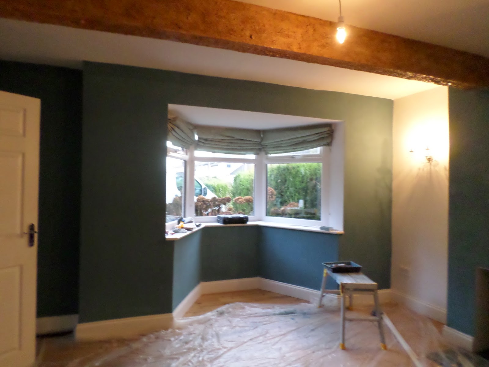
Simon and Simone have chosen a gorgeous colour instead of the white. I'm calling it teal; it is bluer in daylight and greener at night. The pale green blinds were left behind so they have time to figure out window treatments. Some of the white parts will remain. You'll have to use some imagination to see how it turns out, we obviously left them in the middle of their moving process.
 |
| Simon plans to take out the wall sconces and put up book shelves. |
Simon plans to remove the wall sconces and put up book shelves.

That light in the middle of the room has the oddest switch I've ever seen: you hold down a button to dim the light, releasing it just when the light is out. It's not easy to get right and you can fiddle on with it through several cycles. That would be one of the first things to go were this my house!

Radiators can really complicate furniture placement!
 |
| Simone's 'throne'. |
 |
Simone's grandmother's furniture is massive - it makes me think of the Black Forest! They may find it a challenge to place in these small rooms. She mentioned 'getting rid' of some of it - not something I'd personally ever consider. But then I've been accused of buying a house to suit my Grandmother's furniture and I suppose most people do it the other way around...
Latest Update!
 |
| Simon sure worked fast getting those shelves and lights put in! Can't wait to see the stove fired up as well. |
"First Owner":
 |
Their bedroom may have parquet floors under the new beige carpet; then again it might have been linoleum (or even carpet?).
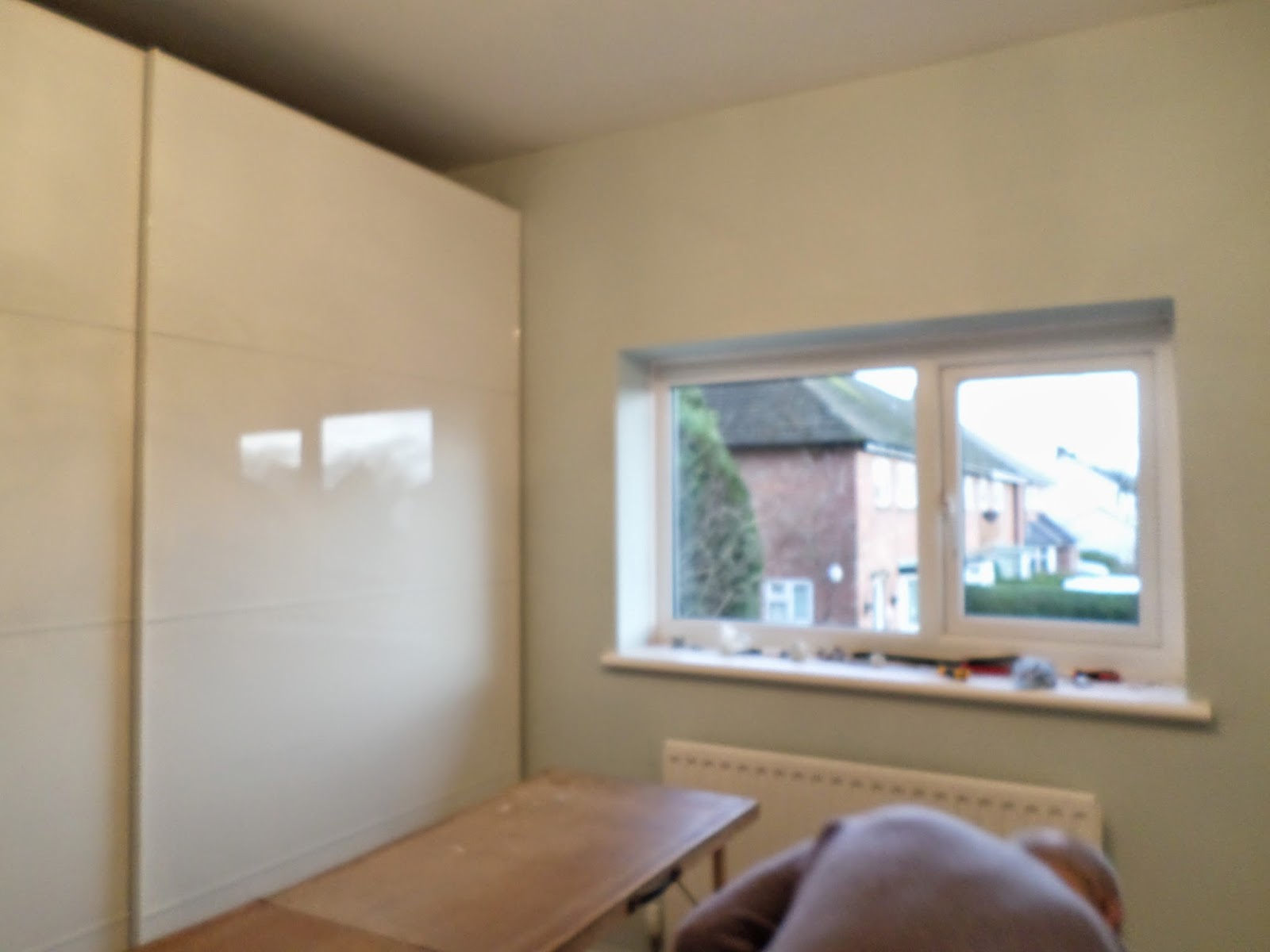
The tiny corner closet has been replaced with a massive Ikea shiny wardrobe.
"The Simon's":
Simon was going to see about papering or painting the shiny surface of the wardrobe. Also adding a cornice (woodwork around the top of the wall).
 |
Bill slaving away...
|
 |
| Ta Da! Mint green and Laura Ashley wall paper! |
Latest Update!
Oh wait, Simon did have a 'before' photo showing the purple walls:
 |
| This gorgeous washstand is one that Simon bought and restored. |
Bedroom 2
"The Remodel-er"
 |
No first owner or Simons' photos. This furniture is all gone of course, replaced in part by a brown couch/fold out bed. This will be Simone's office / guest room. Out that window the view overlooks the neighbour's garden, an empty lot on which another house is to be built and a primary school. Also the foot path that leads to the pub (a quite posh pub, but stupidly expensive).
Bedroom 3
No previous owner photos. This will be Simon's guitar room (have I mentioned he makes guitars?)
 |
The wardrobe takes up about a third of the room, but of course storage space is valuable.
 |
| Amazing wall paper; but the light fixture also casts shadows... too much going on there for me! |
Bathroom
 |
Bill and I disagreed about the shower; I thought it was just right, he thought it too small. "Soak your cares away" (with soap bubbles) remains written above the egg-shaped tub, which must be about the worst design feature I've encountered - the tub, I mean. It is placed at an angle because it's actually too long for the wall. There isn't space to get a broom/mop handle between the ends and the wall. The only way to reach the gap behind the tub is to stand in it and bend in half or to lie on the floor and reach under each end.
Ask me how I know that.
I can't imagine working that hard for anyone other than Simon - probably not even for us!
 |
The funny bit in the corner ceiling is echoed in the guitar room. Bill thinks the builder mis-measured something.
Mind, I doubt there is a perfect house in England...
|
Kitchen
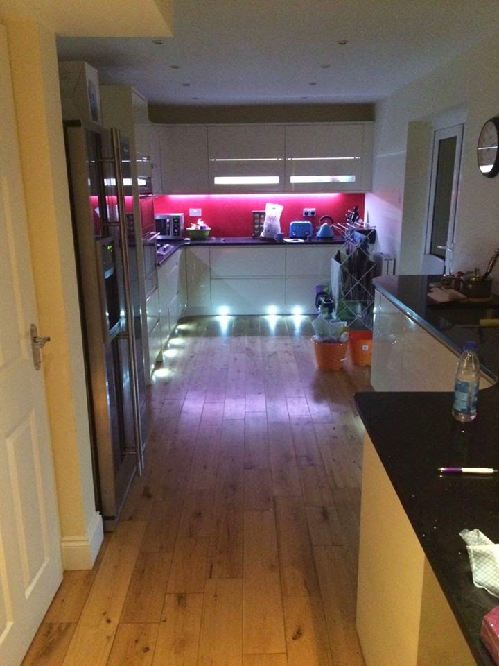
No "First Owner" photos, but "The Remodel-er" knocked together the 12 x 7' kitchen and the 13 x 10' dining room to make this massive kitchen. I love the double oven, the washing machine, slimline dishwasher and even the wine fridge (not that I'd bother with the latter - we all prefer red). I do not love the Amana (made in Iowa!) side by side with ice maker (in England!). Because of said ice maker, the freezer doesn't actually have more space than the one they left behind.
Simon was also keen to replace the ceiling lights - about 10 of them, each with a 40 Watt bulb! Ouch.
Aside from the small appliances (The Simon's have a turqoise toaster and kettle and a fancy coffee maker, of course), the kitchen remains largely the same.
"A house is made of Walls and Beams...A home is made of Hopes and Dreams"(plus hearts) ....gone!
Below is my photo showing the other end of the kitchen - even more massive cupboards/drawers, all highlighted with recessed lighting inside, out and along the floor. Bill liked these well enough to buy a string for our kitchen. I'll let you know if and when they go up (if they stay up). Be warned...it's colourful!
 |
| That orange is NEW...but first, the old. |
Latest Update!
 |
| You can see those jazzy lights now - looks like time for a party! |
Conservatory
"The Remodel-er" clearly loved pink and florals. Simone definitely hates pink, so it had to go. The floral blinds are still up, or were last week. I'm thinking it would be possible to cover them with a different fabric, but I've never attempted it, so I'm not sure. The blinds will have been quite expensive, so I'd not throw them out without some thought.
 |
What a difference blue sky and sunshine can make! I listened to the rain as I painted...much preferable to music in my book.
|

Not much to show here other than one newly painted orange wall. The room gradually filled with boxes to be emptied and furniture to be placed. There is a wood dining table and chairs to replace the white rattan pieces shown above. Also a brown sofa across from what will be the single TV in their house.
Latest Update!
TV and modern sound system in place... I didn't follow the description but apparently it directs sound widely or something. I can see they've been hard at work all week. They're going to have a great house!
Back and Side Gardens
"First Owner":
I'm guessing the "First Owner" may have used this area as an extended drive, perhaps he parked a motor home here? All that sun makes me this this area has lots of planting potential. It is a north facing garden, but the southern sun obviously reaches that far side.
"First Owner" also liked roses, some of which remain.
"The Remodel-er" clearly loved hydrangeas. And garden furniture. And other decor...
Including a barbeque!
"The Simon's"

They bought two apple trees (Simone has a thing about apples) which will be espaliered against that wood fence and a 'weeping willow pear tree' (who knew there was such a thing?) which will take the place of something else stuck in the garden. I suspect some pink hydrangeas are going to disappear, both for fruit trees and for Simon's Shed.
"The Neighbours"
Have an odd sense of humour.
 |
| Why would anyone want a toilet on top of their garage/house extension? |
My only concern is that their neighbour has a toilet on his garage roof, for what purpose I'm not certain. Fortunately, the tall trees around their garden screen this foolishness from their house view. Perhaps they'll learn more when they go around and introduce themselves.
Maybe that's why they got that good price on the house?


No comments:
Post a Comment